
Graphing Data with Python – Matplotlib
When dealing with data analysis problems, it is essential to have the possibility of observing them in some graphical form, therefore in this series of articles I will try to illustrate how to draw graphs in a simple way using python and some libraries created for the purpose.
For the following examples I will use Jupyter notebook, so if you don’t know what it is I invite you to take a look at this article. A possible alternative could be google colab.
| For the following examples I will use Jupyter notebook, so if you don’t know what it is I invite you to take a look at this article. A possible alternative could be google colab . |
Well, if you’ve already installed Jupyter, start creating a new notebook, otherwise I suggest you take a step back and install the software to follow the example step by step.
Creating the Jupyter notebook project
Open a shell, create a new directory and run the command jupyter notebook
mkdir MATPLOTLIB
cd MATPLOTLIB/
jupyter notebook
a window of your browser will open
at this point select the Python 3 interpreter to initialize the environment

The first library we are going to study is:
Matplotlib
Matplotlib is a library with which you can draw 2d and 3d plots. To use it, the first thing we have to do is import it, so we will take advantage of pyplot which offers a programming interface similar to MATLAB.
import matplotlib.pyplot as plt
we also import a very powerful math library numpy
import numpy as np
we choose a function to graph
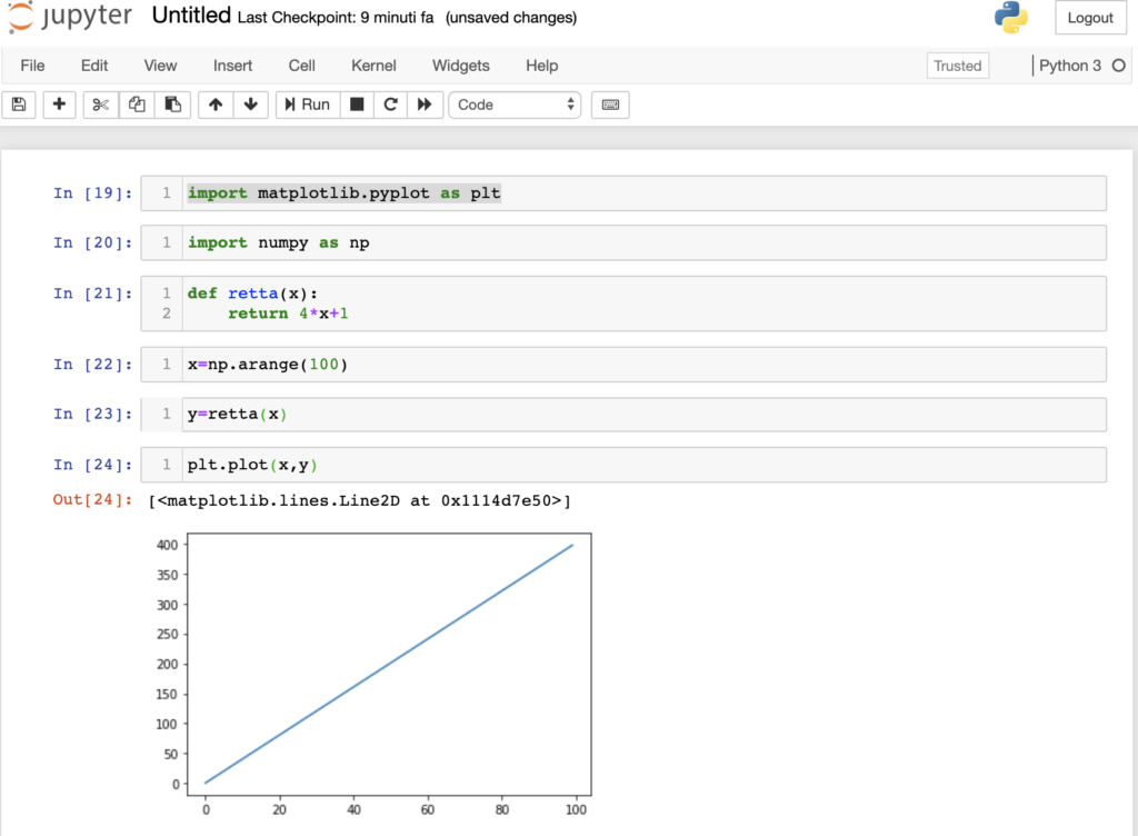
def retta(x):
   return 4*x+1
we define the x range from 0 to 100
x=np.arange(100)
the straight line is defined by:
y=retta(x)
let’s draw the graph
plt.plot(x,y)
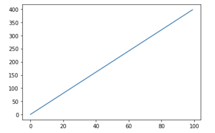
here I report the example in jupyter.
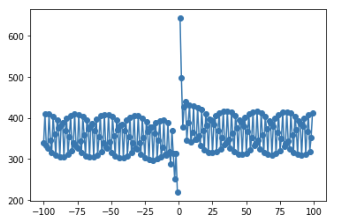
let’s try to do the same example but with a slightly more complex graph
import matplotlib.pyplot as plt

import numpy as np

def f(x):
   return 20 + 105*np.cos(x)*np.sin(x+30) + 144*np.exp(0.5/x+1)

x=np.arange(-100,100)

y=f(x)

plt.plot(x,y)
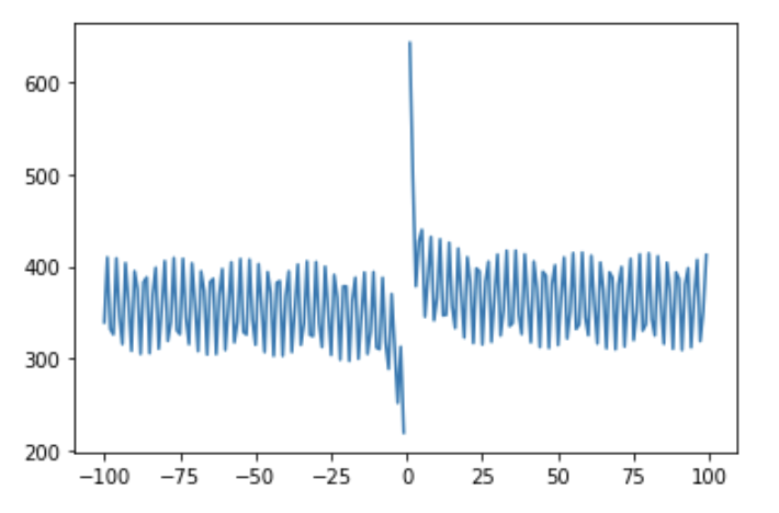
let’s try to explore the possibilities offered by pyplot.
To change the color of the graphs we can use the instruction:
plt.plot(x,y, color="<color_RGB>")
for example
plt.plot(x, y, color='3412F3')
to change the range of the axes I can use the instructions:
plt.xlim(left_x,right_x) or plt.ylim(bottom_y,top_y)
for example
plt.xlim(-10,76)
plt.ylim(-100,600)
plt.plot(x, y)

if instead we wanted, for example, to draw a graph with a dashed or dotted line, we could use the parameter linestyle=”dashed” o linestyle=”dotted” for example:
plt.plot(x,y,linestyle="dashed")

If we wanted to use markers we could use the parameter marker=’o’
plt.plot(x,y, marker='o')
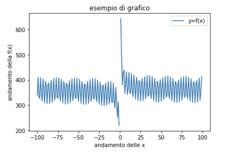
to add information to the axes or a legend we can use the following instructions:
plt.plot(x,y,label="y=f(x)")
plt.title("esempio di grafico")
plt.xlabel("andamento delle x")
plt.ylabel("andamento della f(x)")
plt.legend()
To draw multiple graphs we can follow the following approach:
- we define the functions to graph,
- we define the range of the x’s
- we “plot” the graphs by repeating the plot command for the number of functions to be represented.
import matplotlib.pyplot as plt
import numpy as np

def f(x):
   return 20 + 105*np.cos(x)*np.sin(x+30) + 144*np.exp(0.5/x+1)

def retta(x):
   return 4*x+1

x=np.arange(-100,100)
plt.plot(x,f(x))
plt.plot(x,retta(x))

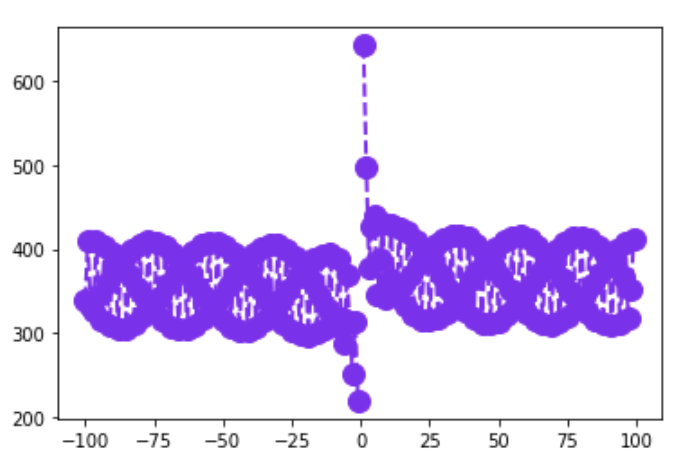
Obviously it is possible to use the various parameters in a single instruction, for example to represent a purple function, with circular markers and dashed line style we can write:
plt.plot(x, y, color='#8712F3', marker='o', linestyle='dashed', linewidth=2, markersize=12)

I am passionate about technology and the many nuances of the IT world. Since my early university years, I have participated in significant Internet-related projects. Over the years, I have been involved in the startup, development, and management of several companies. In the early stages of my career, I worked as a consultant in the Italian IT sector, actively participating in national and international projects for companies such as Ericsson, Telecom, Tin.it, Accenture, Tiscali, and CNR. Since 2010, I have been involved in startups through one of my companies, Techintouch S.r.l. Thanks to the collaboration with Digital Magics SpA, of which I am a partner in Campania, I support and accelerate local businesses.
Currently, I hold the positions of:
CTO at MareGroup
CTO at Innoida
Co-CEO at Techintouch s.r.l.
Board member at StepFund GP SA
A manager and entrepreneur since 2000, I have been:
CEO and founder of Eclettica S.r.l., a company specializing in software development and System Integration
Partner for Campania at Digital Magics S.p.A.
CTO and co-founder of Nexsoft S.p.A, a company specializing in IT service consulting and System Integration solution development
CTO of ITsys S.r.l., a company specializing in IT system management, where I actively participated in the startup phase.
I have always been a dreamer, curious about new things, and in search of “new worlds to explore.”

Comments